
I had a data visualization problem at work. I’ve been thinking about set coverage issues, and wanted to test some ideas for visualizations. I had wanted to visualize the space of aggregate measures (i.e. things like means, etc). It later transpired that I didn’t need it, because my thinking around the issue had been wrong to begin with. I had written some code, and was eager to check it out. By the end of it, it had morphed into something entirely different, but it was a good entertaining night last night nonetheless.
For some reason, the Computer Language Benchmarks Game had been sitting open on one of my browser tabs for about a month now. I wondered if the data was freely available. It was . I rubbed my hands and got to work. An hour later, I have this (explanations and how-to follows).
What Is This All About Then
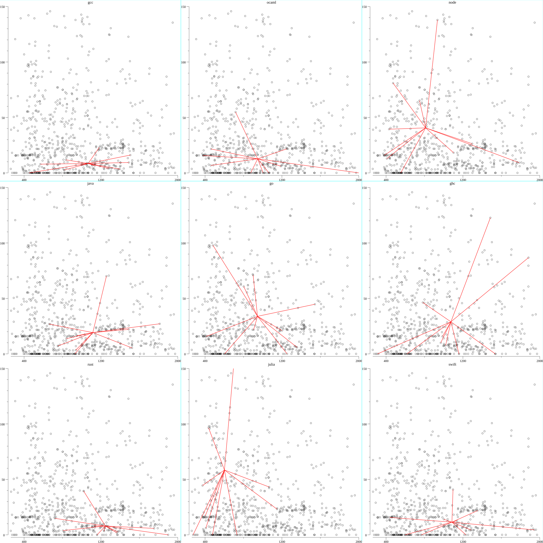
The X-axis represents the size of the clean (i.e. no comments, normalized white space) GZip’d program source code, in bytes. The Y-axis represents performance, as measured by CPU time – the lower, the better. The dots are all the data points for all the benchmarks for all the languages in the Benchmarks Game dataset. In each subplot, are the language specific plots. Each red line is a line from the mean (X, Y) to a data point of the given language. The specific subset of programming languages is arbitrary: they’re languages I’ve written useful programs in (yes, don’t laugh, even NodeJS).
This chart shows the balance between the verbosity of a program written in a language, and the runtime performance of it. The ideal programming language would sit at the lower left quadrant. You may have noticed I left one of my favorite languages, Python, out. This is because I had truncated the chart at the given maximum X and Ys. Such a plot for Python would show no red line. I replaced it with Swift.
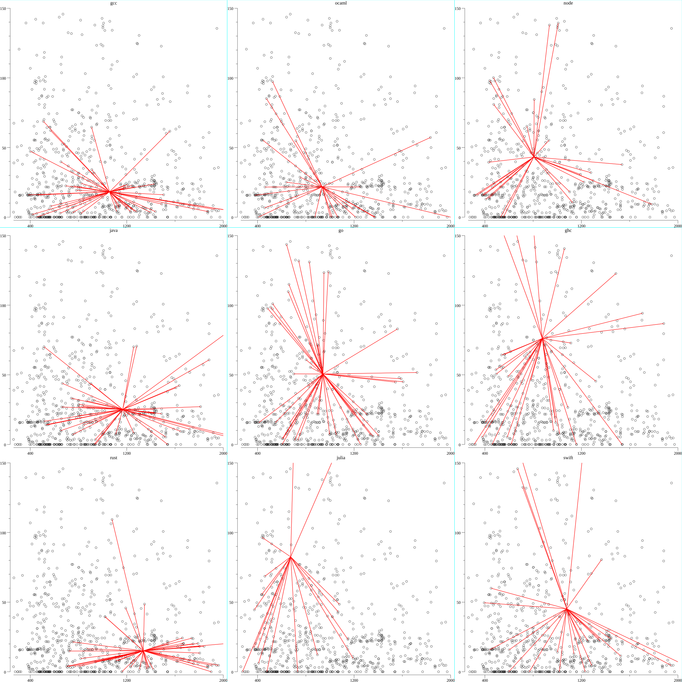
The density of lines show how many programs are being considered. In the dataset, multiple implementations are considered for each benchmark for each language. For the image above, I considered only the highest performing benchmarks for each language benchmark. Here’s one without filtering only the best:
The area is essentially the variance. I had originally wanted to also plot the polygon connecting them. But I reasoned that the human mind is not good at understanding areas, so decided against it.
What’s the point of these charts? Well, for one, it allows me to play the amateur taxonomist. It is by no means formal, but now I can quantify the species of programming languages by the shape of their size-performance plot. It allows for the following observations to be made.
Some Observations
Go is for Buddhists who like “The Middle Way”. It is really average. By sheer chance I left it at the middle of the plot. Rust shares the performance characteristics of C, but is more verbose. The biggest surprise is the functional languages, OCaml, and Haskell. For a language famed for its terseness, Haskell it turns out, isn’t as terse as expected – it’s average size of source code is larger than the average Go source code size. Ocaml on the other hand was the dark horse. It’s about as verbose as Go, but performs better on average. This should be no surprise to anyone using FFTW though. Ocaml has been known to generate great backend code (and I have used Ocaml to generate some initial Gorgonia pieces too).
Julia was rather surprising in several aspects: Julia is a lisp. So its terseness is expected. Julia uses LLVM, which has crazy amazing backend optimization. Which is why its lower performance is somewhat surprising. However, using a median aggregate measure, Julia looks more as expected.
How Was This Made
To the surprise to absolutely no one who reads this blog frequently (hello to the two of you), I wrote it in Go. I used Gonum’s plot library to generate the plots. The full souce code can be found here
The program does warrant some explanations. There are no plot.Plotter for drawing the lines, so I had to write that from scratch. These are the relevant lines:
I didn’t quite remember how to do this. But thankfully I had written a book on how to plot with custom Gonum plotters , so I could just refer to it. If you want full explanations, buy the book, or ask me nicely As part of my marketing contract requirement, I am required to write an article about my book . The experience of writing a book had been more rushed than expected, and if asked, I will say "I could have done better". So I shall subvert this article for the aforementioned marketing purpose .
Further, to tile the plots, I made use of Gorgonia's tensor package
, which provides truly generic multidimensional arrays. It’s not strictly necessary for 3x3 plots, but it was a quick and easy way to do things for me:t:=tensor.New (tensor.WithBacking (ps), tensor.WithShape (len (list) / cols, cols)) matUgh, err:=native.Matrix (t) dieIfErr (err) mat:=matUgh. ([] [] plot.Plot) tiles:=draw.Tiles {Rows: t.Shape () [0], Cols: t.Shape () [1]}(Read More (Full coverage and live updates on the Coronavirus) (Covid). ()suggests using theI do definitely think the tiling function could have been more neatly written. But it is what it is. Old mate Sebastien Binet from Go-HEP
TiledPlot data structure from hplot . I concur with the suggestion. ConclusionI set out to visualize the space of aggregates in neural networks. I got sidetracked and plotted some charts about programming languages as an attempt to quantify them in some way. Came into some probably spurious conclusions. Go is pretty average.
There is somewhere, an irony - this is that I have now taken more time to write this blog post than to write the program. I’d like to hear what you think.
In a case of not-doing-your-research-before-blabbing, Isaac Gouy, current maintainer of the Computer Language Benchmarks Game mentions in the comments below that something similar had been done by Guillaume Marceau
almost a decade ago. Guillaume even has the whole quadrant thing set up and properly explained. Do note that if you want to compare my results with Guillaume’s, the axes are flipped on Guillaume’s
Additionally, the post above have been corrected to include a note that the source code size is GZip’d. This does not change the result of the “analysis” (if ever there was one)


GIPHY App Key not set. Please check settings