
Over the last several years, the way I write CSS has transitioned from a very “semantic” approach to something much more like what is often called “functional CSS.”
Writing CSS this way can evokea pretty visceral reactionfrom a lot of developers, so I’d like to explain how I got to this point and share some of the lessons and insights I’ve picked up along the way.
Phase 1: “Semantic” CSS
One of the best practices you’ll hear about when you’re trying to learn how to CSS good is “separation of concerns.”
The idea is that your HTML should only contain information about yourcontent, and all of your styling decisions should be made in your CSS.
Take a look at this HTML:
Hello there!
See that. Text-centerclass? Centering text is a design decision, so this code violates “separation of concerns” because we’ve let styling information bleed into our HTML.
Instead, the recommended approach is to give your elements class names based on their content, and use those classes ashooksin your CSS to style your markup:
Hello there!
The quintessential example of this approach has always beenCSS Zen Garden; a site designed to show that if you “separate your concerns”, you can completely redesign a site just by swapping out the stylesheet.
My workflow looked something like this:
-
Write the markup I needed for some new UI(an author bio card in this case):
 Adam Wathan
Adam is a rad dude who likes TDD, Active Record, and garlic bread with cheese. He also hosts a decent podcast and has never had a really great haircut.
-
Add a descriptive class or two based on the content:
- Adam WathanAdam is a rad dude who likes TDD, Active Record, and garlic bread with cheese. He also hosts a decent podcast and has never had a really great haircut.
Use those classes as "hooks" in my CSS / Less / Sass to style my new markup:
. author-bio { background-color: white; border: 1px solid hsl (0,0%, 85%); border-radius: 4px; box-shadow: 0 2px 4px rgba (0,0,0,0.1); overflow: hidden; >img { display: block; width: 100%; height: auto; } >div { padding: 1rem; >h2 { font-size: 1. 25 rem; color: rgba (0,0,0,0.8); } >p { font-size: 1rem; color: rgba (0,0,0,0. 75); line-height: 1.5; } } }Here's a demo of the final result:
This approach intuitively made sense to me, and for a while this is how I wrote HTML and CSS.
Eventually though, something started to feel a bit off.
I had "separated my concerns", but there was still a very obvious coupling between my CSS and my HTML. Most of the time my CSS was like a mirror for my markup; perfectly reflecting my HTML structure with nested CSS selectors.
My markup wasn't concerned with styling decisions, but my CSS was very concerned with my markup structure.
Maybe my concerns weren't so separated after all.
Phase 2: Decoupling styles from structure
After looking around for a solution to this coupling, I started finding more and more recommendations towards adding more classes to your markup so you could target them directly; keeping selector specificity low and making your CSS less dependent on your particular DOM structure.
The most well-known methodology that advocates this idea isBlock Element Modifer, orBEMfor short.
Taking a BEM-like approach, the markup for our author bio might look more like this:
... and our CSS would look like this:
. author-bio { background-color: white; border: 1px solid hsl (0,0%, 85%); border-radius: 4px; box-shadow: 0 2px 4px rgba (0,0,0,0.1); overflow: hidden; } .author-bio__image { display: block; width: 100%; height: auto; } .author-bio__content { padding: 1rem; } .author-bio__name { font-size: 1. 25 rem; color: rgba (0,0,0,0.8); } .author-bio__body { font-size: 1rem; color: rgba (0,0,0,0. 75); line-height: 1.5; }This felt like a huge improvement to me. My markup was still "semantic" and didn't contain any styling decisions, and now my CSS felt decoupled from my markup structure, with the added bonus of avoiding unnecessary selector specificity.
But then I ran into a dilemma. Dealing with similar components
Say I needed to add a new feature to the site: displaying a preview of an article in a card layout.
Say this article preview card had a full bleed image on the top, a padded content section below, a bold title, and some smaller body text.
Say it looked exactly like an author bio.
What's the best way to handle this while still separating our concerns?
We can't apply our
. Author-bioclasses to our article preview; that wouldn't be semantic. So we definitely need to make. Article-previewits own component.Here's what our markup could look like:
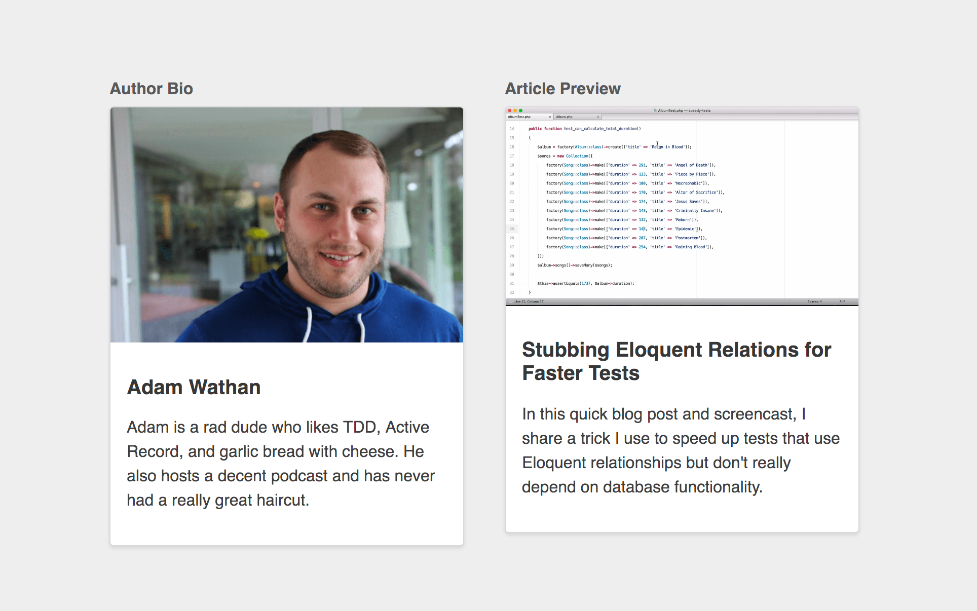
Stubbing Eloquent Relations for Faster Tests
In this quick blog post and screencast, I share a trick I use to speed up tests that use Eloquent relationships but don't really depend on database functionality.
But how should we handle the CSS?
Option 1: Duplicate the styles
One approach would be to straight up duplicate our
. Author-biostyles and rename the classes :. article-preview { background-color: white; border: 1px solid hsl (0,0%, 85%); border-radius: 4px; box-shadow: 0 2px 4px rgba (0,0,0,0.1); overflow: hidden; } .article-preview__image { display: block; width: 100%; height: auto; } .article-preview__content { padding: 1rem; } .article-preview__title { font-size: 1. 25 rem; color: rgba (0,0,0,0.8); } .article-preview__body { font-size: 1rem; color: rgba (0,0,0,0. 75); line-height: 1.5; }This works but of course it's not veryDRY. It also makes it a bit too easy for these components to differ in slightly different ways (maybe a different padding, or font color) which can lead to an inconsistent looking design.
Option 2:
@ extendthe author bio componentAnother approach is to use the
@ extendfeature of your preprocessor of choice; letting you piggy-back off of the styles already defined in our. author-biocomponent:. article-preview { @extend .author-bio; } .article-preview__image { @extend .author-bio__image; } .article-preview__content { @extend .author-bio__content; } .article-preview__title { @extend .author-bio__name; } .article-preview__body { @extend .author-bio__body; }Using
@ extendat all isgenerally not recommended, but that aside, this feels like it solves our problem right?We've removed the duplication in our CSS, and our markup is still free of styling decisions.
But let's examine one more option ...
Option 3: Create a content-agnostic component
Our
. Author-bioand.article-previewcomponents have nothing in common from a "semantic" perspective. One is the bio of an author, the other is a preview of an article.But as we've already seen, they have alotin common from a design perspective.
So if we wanted to, we could create a new component named after what theydohave in common, and reuse that component for both types of content.
Let's call it a
. Media-card.Here's the CSS:
. media-card { background-color: white; border: 1px solid hsl (0,0%, 85%); border-radius: 4px; box-shadow: 0 2px 4px rgba (0,0,0,0.1); overflow: hidden; } .media-card__image { display: block; width: 100%; height: auto; } .media-card__content { padding: 1rem; } .media-card__title { font-size: 1. 25 rem; color: rgba (0,0,0,0.8); } .media-card__body { font-size: 1rem; color: rgba (0,0,0,0. 75); line-height: 1.5; }... here's what the markup for our author bio would look like:
Adam Wathan
Adam is a rad dude who likes TDD, Active Record, and garlic bread with cheese. He also hosts a decent podcast and has never had a really great haircut.
... and here's the markup for our article preview:
Stubbing Eloquent Relations for Faster Tests
In this quick blog post and screencast, I share a trick I use to speed up tests that use Eloquent relationships but don't really depend on database functionality.
This approach also removes the duplication from our CSS, but aren't we "mixing concerns" now?
Our markup all of a sudden knows that we want both of these pieces of content to be styled as media cards. What if we wanted to change how the author bio looked without changing how the article preview looks?
Before, we could just open up our stylesheet and choose new styles for either of the two components. Now we'd need to edit the HTML!Blasphemy!
But let's think about the flip side for a minute.
What if we needed to adda new type of contentthat also needed the same styling?
Using a "semantic" approach, we'd need to write the new HTML, add some content-specific classes as styling "hooks", open up our stylesheet, create a new CSS component for the new content type, and apply the shared styles, either through duplication or using
@ extendor a mixin.Using our content-agnostic
. Media-cardclass, all we'd need to write is the new HTML; we wouldn't have to open the stylesheet at all.If we're really "mixing concerns", shouldn't we need to make changes in multiple places?
"Separation of concerns" is a straw man
When you think about the relationship between HTML and CSS in terms of "separation of concerns", it's very black and white.
You either have separation of concerns(good!), or you don't (***!).
This is not the right way to think about HTML and CSS.
Instead,think aboutdependency direction.
There are two ways you can write HTML and CSS:
-
"Separation of Concerns"CSS that depends on HTML.)Naming your classes based on your content (like
. Author-bio) treats your HTML as a dependency of your CSS.The HTML is independent; it doesn't care how you make it look, it just exposeshookslike
.author-biothatthe HTML controls.Your CSS on the other hand is not independent; it needs to know what classes your HTML has decided to expose, and it needs to target those classes to style the HTML.
In this model, your HTML is restyleable, but your CSS is not reusable.
-
"Mixing Concerns"HTML that depends on CSS.Naming your classes in a content-agnostic way after the repeating patterns in your UI (like
. Media-card) treats your CSS as a dependency of your HTML.The CSS is independent; it doesn't care what content it's being applied to, it just exposes a set of building blocks that you can apply to your markup.
Your HTML is not independent; it's making use of classes that have been provided by the CSS, and it needs to know what classes exist so that it combine them however it needs to to achieve the desired design.
In this model, your CSS is reusable, but your HTML is not restyleable.
CSS Zen Garden takes the first approach, while UI frameworks like (Bootstrap) orBulmatake the second approach.
Neither is inherently "wrong"; it's just a decision made based on what's more important to you in a specific context.
For the project you're working on, what would be more valuable: restyleable HTML, or reusable CSS?
Choosing reusability
The turning point for me came when I read Nicolas Gallagher'sAbout HTML semantics and front-end architecture.
I won't reiterate all of his points here, but needless to say I came away from that blog post fully convinced that optimizing for reusable CSS was going to be the right choice for the sorts of projects I work on. Phase 3: Content-agnostic CSS components
My goal at this point was toexplicitly avoidcreating classes that were based on my content, instead trying to name everything in a way that was as reusable as possible.
That resulted in class names like:
.card. btn,. btn - primary,.btn - secondary. badge.card-list,.card-list-item. img - round.modal-form,. modal-form-section
... and so on and so forth.
I noticed something else when I started focusing on creating reusable classes:
The more a component does, or the more specific a component is, the harder it is to reuse.
Here's an intuitive example.
Say we were building a form, with a few form sections, and a submit button at the bottom.
If we thought of all of the form contents as part of a
. Stacked-formcomponent , we might give the submit button a class like. stacked-form__button:But maybe there's another button on our site that'snotpart of a form that we need to style the same way.
Using the
. Stacked-form__buttonclass on that button wouldn't make a lot of sense ; It's not part of a stacked form.Both of these buttons are primary actions on their respective pages though, so what if we named the button based on what the components have in common and called it
. --primary, removing the. stacked-form __prefix completely?Now say we wanted this stacked form to look like it was in a floated card.
One approach would be to create a modifier and apply it to this form:
-But if we already have a
. Cardclass, why don't wecomposethis new UI using our existing card and stacked form?By taking this approach, we have a
. Cardthat can be a home for any content , and an unopinionated. stacked-formthat can be used inside of any container.We're getting more reuse out of our components, andwe didn't have to write any new CSS.
Composition over subcomponents
Say we needed to add another button to the bottom of our stacked form, and we wanted it to be spaced out a little from the existing button:
One approach would be to create a new subcomponent, like
. Stacked-form__footer, add an additional class to each button like. stacked-form__footer-item, and use descendant selectors to add some margin:


GIPHY App Key not set. Please check settings