

First published in 2013; substantive revision May 2017.
TheFrench translationof this entry is here:Bonheur et satisfaction
How happy are people today? Were people happier in the past? How satisfied with their lives are people in different societies? And how do our living conditions affect all of this?
These are difficult questions to answer; but they are questions that undoubtedly matter for each of us personally. Indeed, today, life satisfaction and happiness are central research areas in the social sciences, including in ‘mainstream’ economics.
Social scientists often recommend that measures of subjective well-being should augment the usual measures of economic prosperity, such asGDP per capita.1But how can happiness be measured? Are there reliable comparisons of happiness across time and space that can give us clues regarding what makes people declare themselves ‘happy’?
In this entry, we discuss the data and empirical evidence that might answer these questions. Our focus here will be on survey-based measures of self-reported happiness and life satisfaction. Here is a preview of what the data reveals.
- Surveys asking people about life satisfaction and happiness do measure subjective well-being with reasonable accuracy.
- Life satisfaction and happiness vary widely both within and among countries. It only takes a glimpse at the data to see that people are distributed along a wide spectrum of happiness levels.
- Richer people tend to say they are happier than poorer people; richer countries tend to have higher average happiness levels; and across time, most countries that have experienced sustained economic growth have seen increasing happiness levels. So the evidence suggests that income and life satisfaction tend to go together (which still doesn’t mean they are one and the same).
- Important life events such as marriage or divorce do affect our happiness, but have surprisingly little long-term impact. The evidence suggests that people tend to adapt to changes.
Happiness across the world today
The World Happiness Report is a well-known source of cross-country data and research on self-reported life satisfaction. The map here shows, country by country, the ‘happiness scores’ published this report.
The underlying source of the happiness scores in the World Happiness Report is theGallup World Poll– a set of nationally representative surveys undertaken in more than 160 countries in over 140 languages. The main life evaluation question asked in the poll is: “Please imagine a ladder, with steps numbered from 0 at the bottom to 10 at the top. The top of the ladder represents the best possible life for you and the bottom of the ladder represents the worst possible life for you. On which step of the ladder would you say you personally feel you stand at this time? ”(Also known as the“ Cantril Ladder ”.)
The map plots the average answer that survey- respondents provided to this question in different countries. As with the steps of the ladder, values in the map range from 0 to 10.
There are large differences across countries. According to 2016 figures, Nordic countries top the ranking: Finland, Norway, Denmark, the Netherlands and Iceland have the highest scores (all with averages above 7). In the same year, the lowest national scores correspond to Central African Republic, South Sudan, Tanzania, Rwanda and Haiti (all with average scores below 3.5).
You can click on any country on the map to plot time-series for specific countries.
As we can see, self-reported life satisfaction correlates with other measures of well-being — richer and healthier countries tend to have higher average happiness scores. (More on this in the sectionbelow.)
Happiness over time
In addition to the Gallup World Poll (discussed above), theWorld Value Surveyalso provides cross-country data on self-reported life satisfaction. These are the longest available time series of cross-country happiness estimates that include non-European nations.
The World Value Survey collects data from a series of representative national surveys covering almost 100 countries, with the earliest estimates dating back to 1981. In these surveys, respondents are asked: “Taking all things together, would you say you are (i) Very happy, (ii) Rather happy, (iii) Not very happy or (iv) Not at all happy”. This visualization plots the share of people answering they are Very happy or Rather happy.
As we can see, in the majority of countries the trend is positive: In 49 of the 69 countries with data from two or more surveys,the most recent observation is higher than the earliest. In some cases, the improvement has been very large; in Zimbabwe, for example, the share of people who reported being ‘very happy’ or ‘rather happy’ went from 56. 4% in 2004 to 82. 1% in 2014.
TheEurobarometercollects data on life satisfaction as part of their public opinion surveys. For several countries, these surveys have been conducted at least annually for more than 40 years. The visualization here shows the share of people who report being ‘very satisfied’ or ‘fairly satisfied’ with their standards of living, according to this source.
Two points are worth emphasizing. First, estimates of life satisfaction often fluctuate around trends. In France, for example, we can see that the overall trend in the period 1974 – 2016 is positive; yet there is a pattern of ups and downs. And second, despite temporary fluctuations, decade-long trends have been generally positive for most European countries.
In most cases, the share of people who say they are ‘very satisfied’ or ‘fairly satisfied ‘with their life has gone up over the full survey period.2Yet there are some clear exceptions, of which Greece is the most notable example. Add Greece to the chart and you can see that in 2007, around 67% of the Greeks said they were satisfied with their life; but five years later, after the financial crisis struck, the corresponding figure was down to 32 .4%. Despite recent improvements, Greeks today are on average much less satisfied with their lives than before the financial crisis. No other European country in this dataset has gone through a comparable negative shock.
The distribution of life satisfaction
Most of the studies comparing happiness and life satisfaction among countries focus on averages. However, distributional differences are also important.
Life satisfaction is often reported on a scale from 0 to 10, with 10 representing the highest possible level of satisfaction. This is the so-called ‘Cantril Ladder’. This visualization shows how responses are distributed across steps in this ladder. In each case, the height of bars is proportional to the fraction of answers at each score. Each differently-colored distribution refers to a world region; and for each region, we have overlaid the distribution for the entire world as a reference.
These plots show that in sub-Saharan Africa — the region with the lowest average scores – the distributions are consistently to the left of those in Europe. In economics lingo, we observe that the distribution of scores in European countriesstochastically dominatesthe distribution in sub-Saharan Africa.
This means that the share of people who are ‘happy’ is lower in sub-Saharan Africa than in Western Europe, independently of which score in the ladder we use as a threshold to define ‘happy’. Similar comparisons can be made by contrasting other regions with high average scores (eg North America, Australia and New Zealand) against those with low average scores (eg South Asia).
Another important point to notice is that the distribution of self-reported life satisfaction in Latin America is high across the board — it is consistently to the right of other regions with roughly comparable income levels, such as Central and Eastern Europe.
This is part of a broader pattern: Latin American countries tend to have a higher subjective well-being than other countries with comparable levels of economic development. As we will see in the section onsocial environment, culture and history matter for self-reported life satisfaction.
If you are interested in data on country-level distributions of scores, thePew Global Attitudes Surveyprovides such figures for more than 40 Countries.

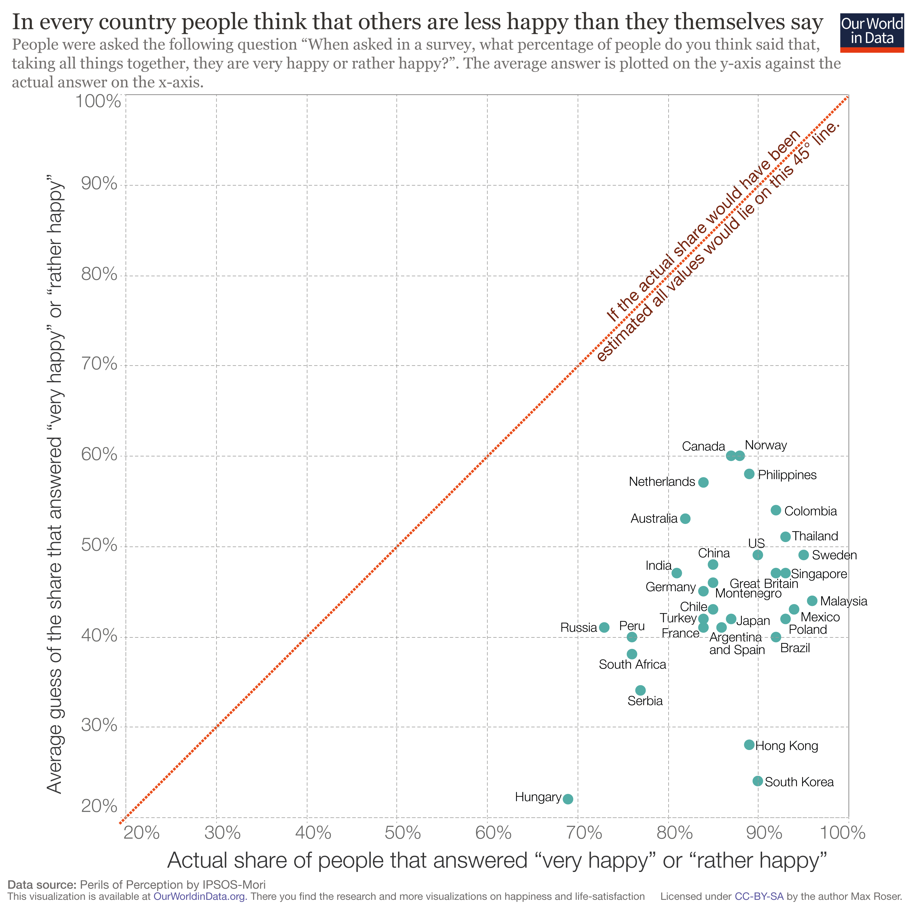
(Mis) perceptions about others’ happiness
We tend to underestimate the average happiness of people around us. The visualization shown demonstrates this for countries around the world, using data from Ipsos’Perils of Perception– a cross-country survey asking people to guess what others in their country have answered to the happiness question in the World Value Survey.
The horizontal axis in this chart shows the actual share of people who said they are ‘Very Happy’ or ‘Rather Happy’ in the World Value Survey; the vertical axis shows the averageguessof the same number (ie the average guess that respondents made of the share of people reporting to be ‘Very Happy’ or ‘Rather Happy’ in their country).
If respondents would have guessed the correct share, all observations would fall on the red 45 – degree line. But as we can see, all countries are far below the 45 – degree line. In other words, people in every country underestimated the self-reported happiness of others. The most extreme deviations are in Asia — South Koreans think that 24% of people report being happy, when in reality 90% do.
The highest guesses in this sample (Canada and Norway) are 60% – this is lower than the lowest actual value of self-reported happiness in any country in the sample (corresponding to Hungary at 69%).
Why do people get their guesses so wrong? It’s not as simple as brushing aside these numbers by saying they reflect differences in ‘actual’ vs. reported happiness.
One possible explanation is that people tend to misreport their own happiness, therefore the average guesses might be a correct indicator of true life satisfaction (and an incorrect indicator ofreportedlife satisfaction). However, for this to be true, people would have to commonly misreport their own happiness while assuming that others donotmisreport theirs.
And people are not bad at judging the well-being of other people who they know: There is substantial evidence showing thatratings of one’s happiness made by friends correlate with one’s happiness, and thatpeople are generally good at evaluating emotions from simply watching facial expressions.
An alternative explanation is that this mismatch is grounded in the well-established fact that people tend to be positive about themselves, but negative about other people they don’t know.It has been observed in other contexts that people can be optimistic about their own future, while at the same time being deeply pessimis tic about the future of their nation or the world. We discuss this phenomenon in more detail in our entry onoptimism and pessimism, specifically in a section dedicated toindividual optimism and social pessimism
Differences in happiness within countries
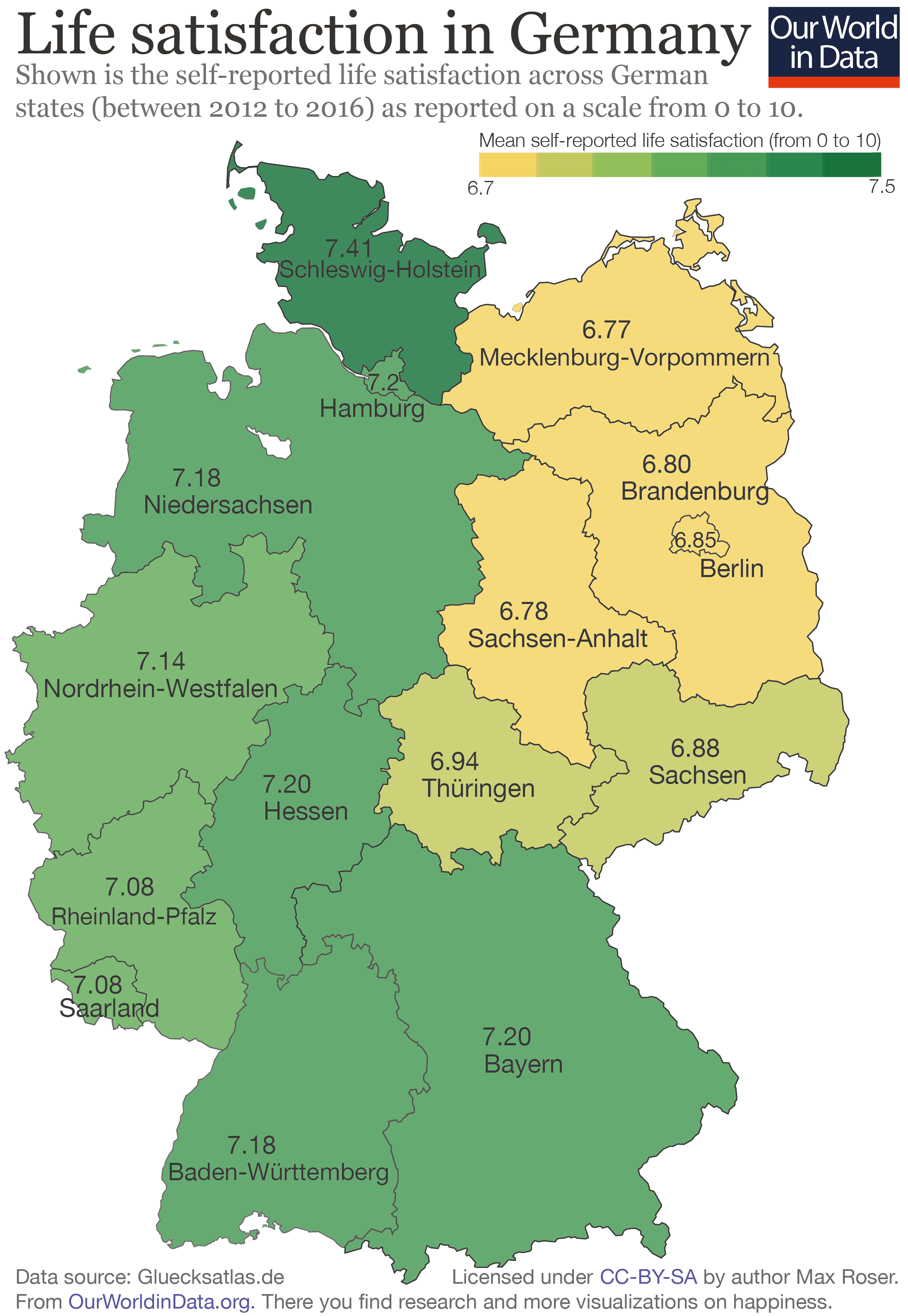
East and West Germany
In global surveys of happiness and life satisfaction ,Germany usually ranks high. However, these national averages mask large inequalities. In the map shown we focus on regional inequalities — specifically the gap in life satisfaction between West and East Germany.
This map plots self-reported life satisfaction in Germany (using the0 – Cantril Ladder question), aggregating averages scores at the level ofFederal States.3What stands out is a clear divide between the East and the West, along the political division that existed before the re unification of Germany in 1990.
For example, the difference in levels between neighboring Schleswig-Holstein (in West Germany) and Mecklenburg-Vorpommern (in East Germany) are similar to the difference betweenSweden and the US– a significant contrast in self-reported life satisfaction.
Several academic studies have looked more closely at this ‘happiness gap’ in Germany using data from more detailed surveys, such as the German Socio-Economic Panel (eg Petrunyk and Pfeifer 2016).4These studies provide two main insights:
First, the gap is partly driven by differences in household income and employment. But this is not the only aspect; even after controlling for socioeconomic and demographic differences, the East-West gap remains significant.
And second, the gap has been narrowing in recent years, as the chart shows. In fact, the finding that the gap is narrowing is true both for the raw average differences, as well as for the ‘conditional differences’ (ie the differences that are estimated after controlling for socioeconomic and demographic characteristics).
The observation that socioeconomic and demographic differences do not fully predict the observed East-West differences in self-reported happiness is related to a broader empirical phenomenon: Culture and history matter for self-reported life satisfaction — and in particular, ex-communist countries tend to have a lower subjective well-being than other countries with comparable levels of economic development.
Trends in life satisfaction for East and West Germany, 1992 – 2013

The General Social Survey (GSS) in the US is a survey administered to a nationally representative sampleof about 1, 500 respondents every year since 1972, and i s an important source of information on long-run trends of self-reported life satisfaction in the country.5
Using this source, Stevenson and Wolfers (2008)6show that while the national average has remained broadly constant, inequality in happiness has fallen substantially in the US in recent decades.
The authors further note that this is true both when we think about inequality in terms of the dispersion of answers, and also when we think about inequality in terms of gaps between demographic groups. They note that two-thirds of the black-white happiness gap has been eroded (although today white Americans remain happier on average, even after controlling for differences in education and income), and the gender happiness gap has disappeared entirely (women used to be slightly happier than men, but they are becoming less happy, and today there is no statistical difference once we control for other characteristics).7
The results from Stevenson and Wolfers are consistent with other studies looking at changes of happiness inequality (or life satisfaction inequality) over time. In particular, researchers have noted that there is a correlation between economic growth and reductions in happiness inequality — even whenincome inequalityis increasing at the same time. The visualization here uses data from Clark, Fleche and Senik (2015)8shows this. It plots the evolution of happiness inequality within a selection of rich countries that experienced uninterrupted GDP growth.
In this chart, happiness inequality is measured by the dispersion – specifically the standard deviation – of answers in the World Value Survey. As we can see, there is a broad negative trend. In their paper the authors show that the trend is positive in countries with falling GDP.
Why could it be that happiness inequality falls with rising income inequality?
Clark, Fleche, and Senik argue that part of the reason is that the growth of national income allows for the greater provision of public goods, which in turn tighten the distribution of subjective well-being. This can still be consistent with growing income inequality, since public goods such asbetter healthaffect incomes and well-being differently.
Another possibility is that economic growth in rich countries has translated into a more diverse society in terms of cultural expressions (eg through the emergence of alternative lifestyles), which has allowed people to converge in happiness even if they diverge in incomes, tastes and consumption. Steven Quartz and Annette Asp explain this hypothesis in aNew York Times article, discussing evidence from experimental psychology.
The link between happiness and income
The link across countries
If we compare life satisfaction reports from around the world at any given point in time, we immediately see that countries with higher average national incomes tend to have higher average life satisfaction scores. In other words: People in richer countries tend to report higher life satisfaction than people in poorer countries. The scatter plot here shows this.
Each dot in the visualization represents one country. The vertical position of the dots shows national average self-reported life satisfaction in the Cantril Ladder (a scale ranging from 0 – 10 where 10 is the highest possible life satisfaction); while the horizontal position shows GDP per capita based on purchasing power parity (ie GDP per head after adjusting for inflation and cross-country price differences).
This correlation holds even if we control for other factors: Richer countries tend to have higher average self-reported life satisfaction than poorer countries that are comparable in terms of demographics and other measurable characteristics. You can read more about this in theWorld Happiness Report 2017, specifically the discussion in Chapter 2.
As we show below, income and happiness also tend to go togetherwithin countriesandacross time.
The link within countries
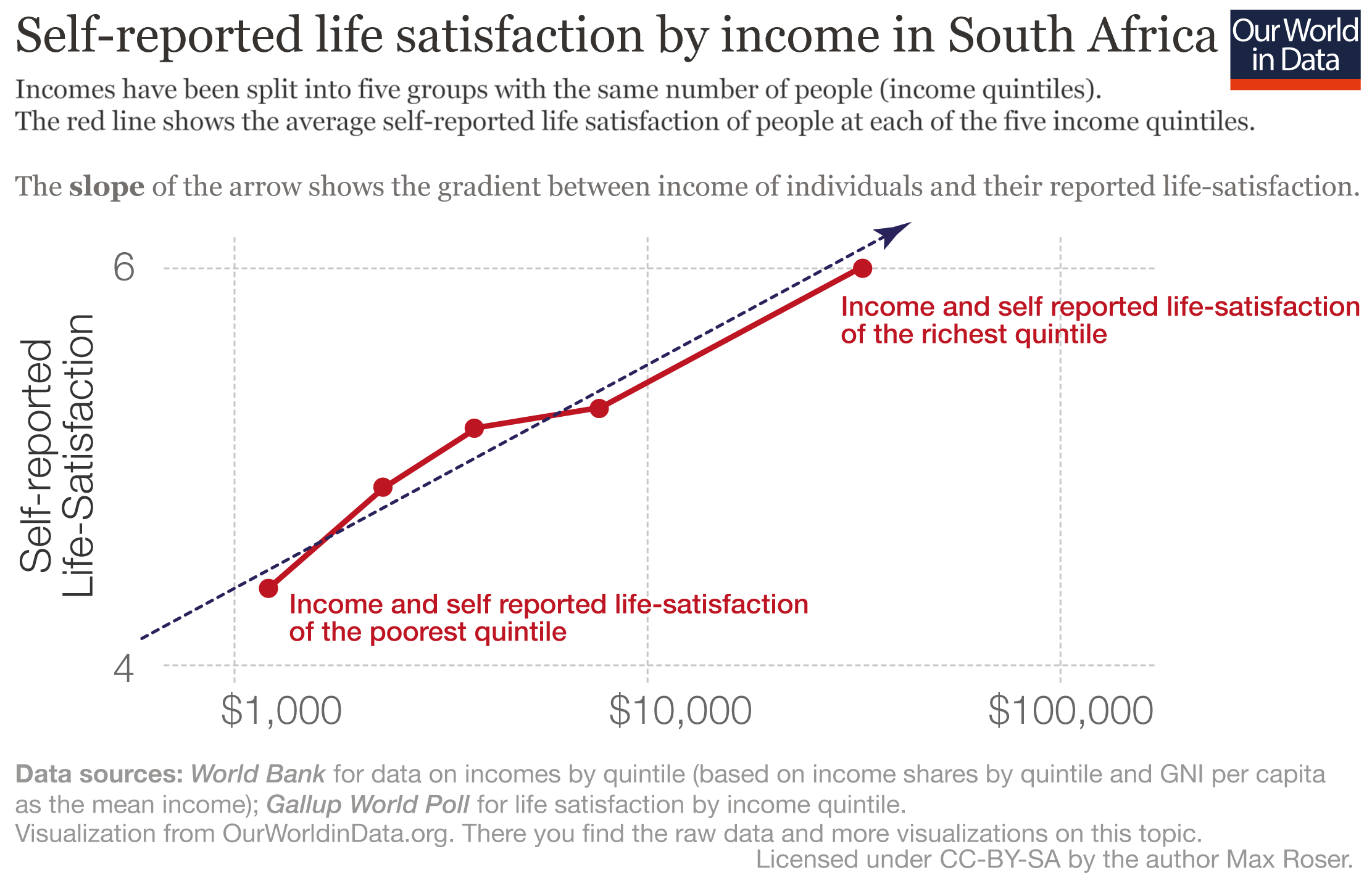
Above we point out that richer countries tend to be happier than poorer countries. Here we show that the same tends to be true within countries: richer people within a country tend to be happier than poorer people in the same country. The visualisations here show us this this by looking at happiness by income quintiles.
Firstly we show each country in individual panels: within each panel is a connected scatter plot for a specific country. This means that for each country, we observe a line joining five points: each point marks the average income within an income quintile (horizontal axis) against the average self-reported life satisfaction of people at that income quintile (vertical axis).
What does this visualization tell us? We see that in all cases lines are upward sloping: people in higher income quintiles tend to have higher average life satisfaction. Yet in some countries the lines are steep and linear (e.g. in Costa Rica richer people are happier than poorer people across the whole income distribution); while in some countries the lines are less steep and non-linear (eg the richest group of people in the Dominican Republic is as happy as the second-richest group).
In a second visualization we present the same data, but instead of plotting each country separately, showing all countries in one grid.
The resulting connected scatter plot may be messy, resembling a ‘spaghetti’ chart, but it is helpful to confirm the overall pattern: despite kinks here and there, lines are by and large upward sloping.
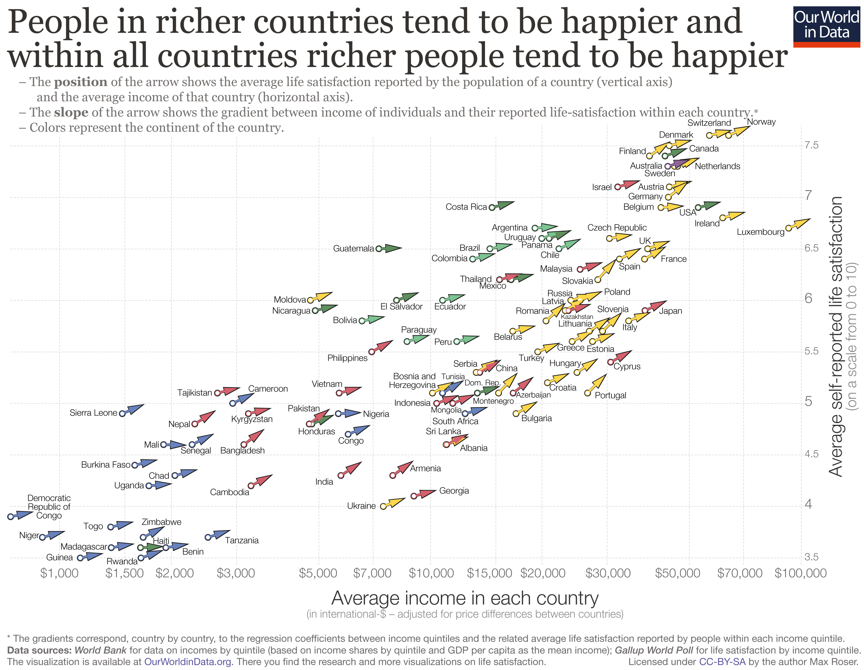
Looking across and within countries
Do income and happiness tend to go together? The visualization here shows that the answer to this question is yes, both within and across countries.
It may take a minute to wrap your head around this visualization, but once you do, you can see that it handily condenses the key information from the previous three charts into one.
To show the income-happiness correlation across countries, the chart plots the relationship between self-reported life satisfaction on the vertical axis and GDP per capita on the horizontal axis. Each country is an arrow on the grid, and the location of the arrow tells us the corresponding combination of average income and average happiness.
To show the income-happiness correlationwithincountries, each arrow has a slope corresponding to the correlation between household incomes and self-reported life satisfaction within that country. In other words: the slope of the arrow shows how strong the relationship between income and life satisfaction is within that country. (This chartgives you a visual example of how the arrows were constructed for each country).9
If an arrow points northeast, that means richer people tend to report higher life satisfaction than poorer people in the same country. If an arrow is flat (ie points east), that means rich people are on average just as happy as poorer people in the same country.
As we can see, there is a very clear pattern: richer countries tend to be happier than poorer countries (observations are lined up around an upward-sloping trend), and richer people within countries tend to be happier than poorer people in the same countries (arrows are consistently pointing northeast).
It’s important to note that the horizontal axis is measured in a logarithmic scale. The cross-country relationship we would observe in a linear scale would be different, since at high national income levels, slightly higher national incomes are associated with a smaller increase in average happiness than at low levels of national incomes. In other words, the cross-country relationship between income and happiness is not linear on income (it is ‘log-linear’). We use the logarithmic scale to highlight two key facts: (i) at no point in the global income distribution is the relationship flat; and (ii) a doubling of the average income is associated with roughly the same increase in the reported life-satisfaction, irrespective of the position in the global distribution.
These findings have been explored in more detail in a number of recent academic studies. Importantly, the much-cited paper by Stevenson and Wolfers (2008)10shows that these correlations hold even after controlling for various country characteristics such as demographic composition of the population, and are robust to different sources of data and types of subjecti ve well-being measures.
Economic growth and happiness
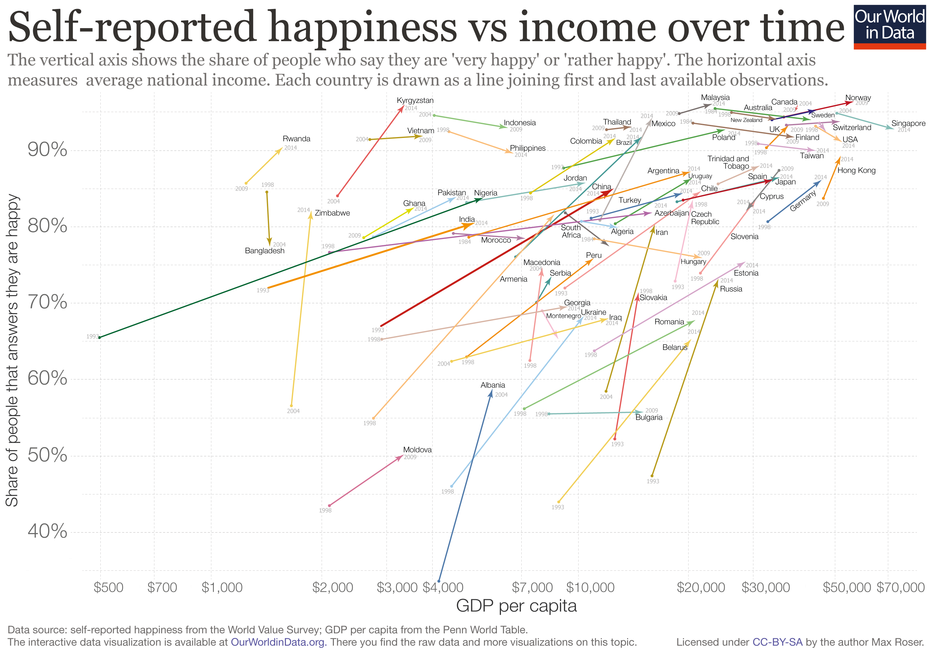
In the charts above we show that there is robust evidence of a strong correlation between income and happiness across and within countries at fixed points in time. Here we want to show that, while less strong, there is also a correlation between income and happiness across time. Or, put differently, as countries get richer, the population tends to report higher average life satisfaction.
The chart shown here uses data from the World Value Survey to plot the evolution of national average incomes and national average happiness over time. To be specific, this chart shows the share of people who say they are ‘very happy’ or ‘rather happy’ in the World Value Survey (vertical axis), against GDP per head (horizontal axis). Each country is drawn as a line joining first and last available observations across all survey waves.11
As we can see, countries that experience economic growth also tend to experience happiness growth across waves in the World Value Survey. And this is a correlation that holds after controlling for other factors that also change over time (inthis chartfrom Stevenson and Wolfers 2008) you can see how changes in GDP per capita compare to changes in life satisfaction after accounting for changes in demographic composition and other variables).
An important point to note here is that economic growth and happiness growth tend to go togetheron average. Some countries in some periods experience economic growth without increasing happiness. The experience of the US in recent decades is a case in point. These instances may seem paradoxical given the evidence — we explore this question in the following section.
The Easterlin Paradox
The observation that economic growth does not always go together with increasing life satisfaction was first made by Ri chard Easterlin in the 1970 s. Since then, there has been much discussion over what came to be known as the ‘Easterlin Paradox’.
At the heart of the paradox was the fact that richer countries tend to have higher self- reported happiness, yet in some countries for which repeated surveys were available over the course of the 1970 s, happiness was not increasing with rising national incomes. This combination of empirical findings was paradoxical because the cross-country evidence (countries with higher incomes tended to have higher self-reported happiness) did not, in some cases, fit the evidence over time (countries seemed not to get happier as national incomes increased ).
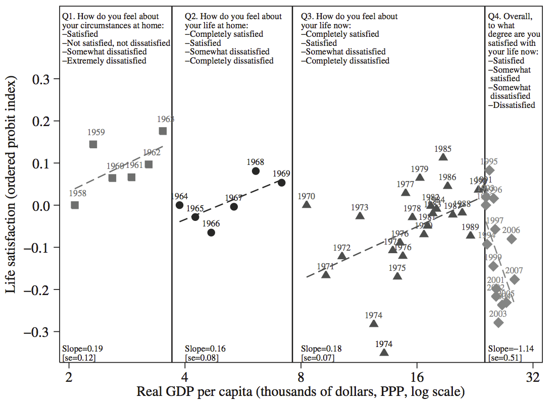
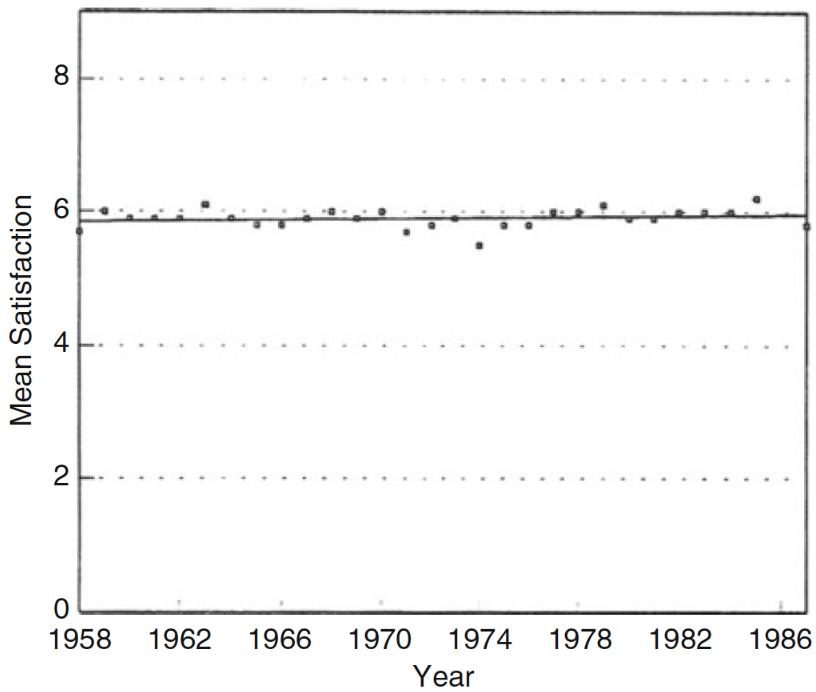
Notably, Easterlin and other researchers relied on data from the US and Japan to support this seemingly perplexing observation. If we look closely at the data underpinning the trends in these two countries, however, these cases are not in fact paradoxical.
Let us begin with the case of Japan. There, the earliest available data on self-reported life satisfaction came from the so-called ‘Life in Nation surveys’, which date back to 1958. At first glance, this source suggests that mean life satisfaction remained flat over a period of spectacular economic growth (see for examplethis chartfrom Easterlin and Angelescu 2011).12Digging a bit deeper, however, we find that things are more complex.
Stevenson and Wolfers (2008)13show that the life satisfaction questions in the ‘Life in Nation surveys’ changed over time, making i t difficult — if not impossible — to track changes in happiness over the full period. The visualization here splits the life satisfaction data from the surveys into sub-periods where the questions remained constant. As we can see, the data is not supportive of a paradox: the correlation between GDP and happiness growth in Japan is positive within comparable survey periods. The reason for the alleged paradox is in fact mismeasurement of how happiness changed over time.
In the US, the explanation is different, but can once again be traced to the underlying data. Specifically, if we look more closely at economic growth in the US over the recent decades, one fact looms large: growth has not benefitted the majority of people. Income inequality in the US is exceptionally high and has been on the rise in the last four decades, with incomes for the median household growing much more slowly than incomes for the top 10%. As a result, trends in aggregate life satisfaction should not be seen as paradoxical: the income and standard of living of the typical US citizen has not grown much in the last couple of decades. (You can read more about this in our entry oninequality and incomes across the distribution
GDP per capita vs Life satisfaction across survey questions, Japan, 1958 – 2007 – Stevenson and Wolfers (2008)14
Health and life satisfaction
Life expectancy and life satisfaction
Health is an important predictor of life satisfaction, both within and among countries. In this visualization, we provide evidence of the cross-country relationship.
Each dot in the scatterplot represents one country. The vertical position of the dots shows national life expectancy at birth, and the horizontal position shows national average self-reported life satisfaction in the Cantril Ladder (a scale ranging from 0 – 10 where 10 is the highest possible life satisfaction) .
As we can see, there is a strong positive correlation: countries where people tend to live longer are also countries where people tend to say more often that they are satisfied with their lives. A similar relationship holds for other health outcomes (eglife satisfaction tends to be higher in countries with lower child mortality).
The relationship plotted in the chart clearly reflect more than just the link between health and happiness, since countries with high life expectancy also tend to be countries with many other distinct characteristics. However, the positive correlation between life expectancy and life satisfaction remains after controlling for observable country characteristics, such as incomes and social protection. You can read more about this in theWorld Happiness Report 2017, specifically the discussion in Chapter 2.
Mental health and happiness
When trying to discern a relationship betweenmental healthand happiness, it is important to distinguish between macro and micro-level correlations. When we look at macro-level, (cross-country trends) in the prevalence of mental health disorders such as depression versus self-reported life satisfaction there is no clear relationship: it does not appear that countries with higher depression rates have lower self-reported happiness.
However, when we look at micro-level, within-country correlations the data tells a different story. In this visualization, we provide evidence of the relationship between health and subjective well-being within countries — specifically; we focus here on mental health and self-reported life satisfaction.
Each bar in the visualization measures the extent to which mental illness (depression and anxiety) is associated with self-reported life satisfaction, once we control for physical illness and other factors such as income and education. In other words, the bars show a ‘conditional correlation’ — the strength of the link between mental illness and happiness after accounting for other factors.
The negative values show that people who have been diagnosed with depression or anxiety tend to be more likely to have lower self-reported life satisfaction.
The size of the coefficients, particularly in the US, and Australia, tell us that the relationship we observe is very strong. For context, in the UK, the US and Australia the magnitude of the correlation between mental illness and life satisfaction ishigher than the magnitude for the correlation between income and life satisfaction.
Clearly, this correlation is likely the result of a two-way relationship: depressed and anxious people are less likely to be happy, and unhappy people are more likely to be depressed or anxious. Nevertheless, it is still important to bear in mind that anxiety, depression and unhappiness often go together.
Other studies provide further evidence of not only the negative correlation between depression and life satisfaction (ie individuals with more severe depression report lower life satisfaction), but also evidence that treatment and improvement in depression are linked to increases in self-reported life satisfaction.15
Evidence suggests that this correlation between happiness and mental health may not only be realized through self-reported life satisfaction, but also through the strength ofbehaviors related to happiness, such as smiling and facial expression. When asked to visualize happy and sad situations, researchers found individuals with depression to show notably less facial muscle activity relative to those without – a suggestion sign of both lower emotivity and disengagement.16
Life satisfaction through life events
How do common life events affect happiness?
Do people tend to adapt to common life events by converging back to a baseline level of happiness?
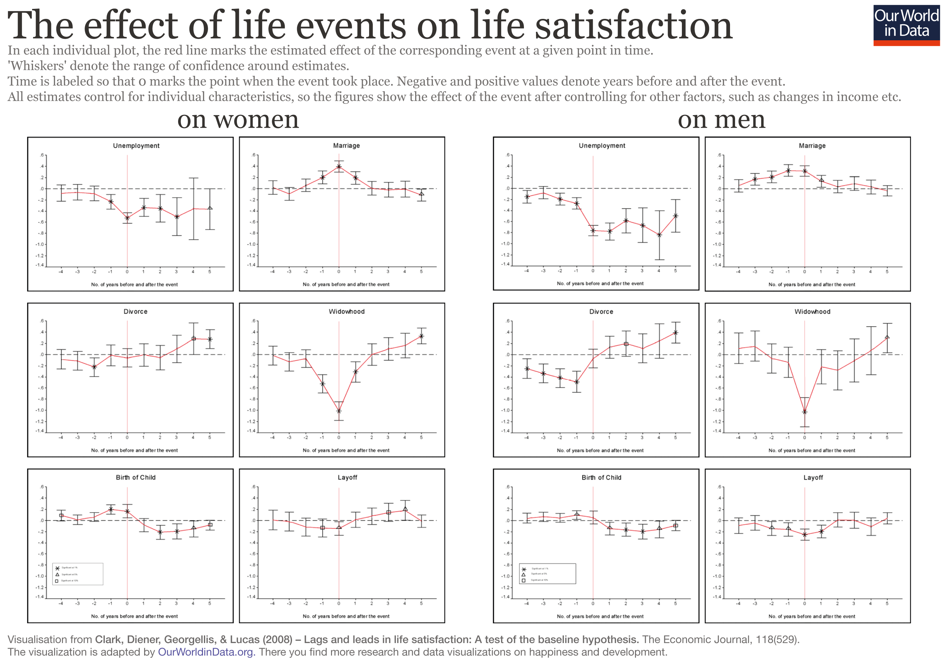
Clark et al. (2008)17use data from the German Socio-Economic Panel to identify groups of people experiencing significant life and labor market events, and trace how these events affect the evolution of their life satisfaction. The visualization here shows an overview of their main findings. In each individual chart, the red lines mark the estimated effect of a different event at a given point in time (with ‘whiskers’ marking the range of confidence of each estimate).
In all cases the results are split by gender, and time is labeled so that 0 marks the point when the corresponding event took place (with negative and positive values denoting years before and after the event). All estimates control for individual characteristics, so the figures show the effect of the event after controlling for other factors (eg income, etc.).
The first point to note is that most events denote the evolution of a latent situation: People grow unhappy in the period building up to a divorce, while they grow happy in the period building up to a marriage.
The second point is that single life events do tend to affect happiness in the short run, but people often adapt to changes. Of course, there are clear differences in the extent to which people adapt. In the case of divorce, life satisfaction first drops, then goes up and stays high. For unemployment, there is a negative shock both in the short and long-run, notably among men. And for marriage, life satisfaction builds up before, and fades out after the wedding.
In general, the evidence suggests that adaptation is an important feature of well-being. Many common but important life events have a modest long-term impact on self-reported happiness. Yet adaptation to some events, such as long-term unemployment, is neither perfect nor immediate.
Does disability correlate with life satisfaction?
A number of papers have noted that long-term paraplegics do not report themselves as particularly unhappy, when compared to non-paraplegics (see for example the much-cited paper by Brickman, Coates, and Janoff-Bulman, 1978).18
This assertion has received attention because it tells us something about the very meaning of well-being and has important consequences for policy. It is, for example, considered in courts of law with respect to the compensation for disability.
However, comparing differences in self-reported life satisfaction among people with different disability statuses is not an ideal source of evidence regarding the effect of tragedy on happiness. Non-paraplegics are potentially different to paraplegics in ways that are hard to measure. A better source of evidence are longitudinal surveys where people are tracked over time.
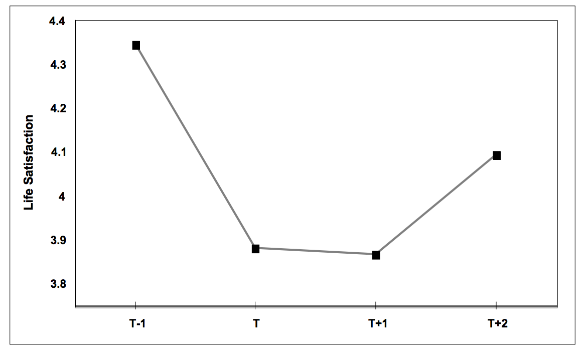
Oswald and Powdthavee (2008)19use data from a longitudinal survey in the UK to explore whether accidents leading to disability imply long-term sh
The chart here, from Oswald and Powdthavee, shows the average reported life satisfaction of a group of people who became seriously disabled (at time T) and remained seriously disabled in the two following years (T 1 and T 2). Here, ‘seriously disabled’ means that disability prevented them from being able to do day-to-day activities.
As we can see — and as the authors show more precisely through econometric techniques— those entering disability suffer a sudden drop in life satisfaction, and recover only partially. This supports the idea that while adaptation plays a role for common life events, the notion of life satisfaction is indeed sensitive to tragic events.
Life satisfaction and society
Culture and life satisfaction
Comparisons of happiness among countries suggest that culture and history shared by people in a given society matter for self-reported life satisfaction. For example, as the chart here shows, culturally and historically similar Latin American countries have a higher subjective well-being than other countries with comparable levels of economic development. (This chart plots self-reported life satisfaction as measured in the 10 – point Cantril ladder in the vertical axis, against *** per capita in the horizontal axis).
Latin America is not a special case in this respect. Ex-communist countries, for example, tend to have lower subjective well-being than other countries with comparable characteristics and levels of economic development.
Academic studies in positive psychology discuss other patterns. Diener and Suh (2002) write: “In recent years cultural differences in subjective well-being have been explored, with a realization that there are profound differences in what makes people happy. Self-esteem, for example, is less strongly associated with life satisfaction, and extraversion is less strongly associated with pleasant affect in collectivist cultures than in individualist cultures ”.20
To our knowledge, there are no rigorous studies exploring the causal mechanisms linking culture and happiness. However, it seems natural to expect that cultural factors shape the way people collectively understand happiness and the meaning of life.

Sense of freedom and life satisfaction
A particular channel through which social environment may affect happiness is freedom: the society we live in may crucially affect the availability of options that we have to shape our own life.
This visualization shows the relationship between self-reported sense of freedom and self-reported life satisfaction using data from theGallup World Poll. The variable measuring life satisfaction corresponds to country-level averages of survey responses to the Cantril Ladder question (a 0 – (scale, where) is the highest level of life satisfaction); while the variable measuring freedom corresponds to the share of people who agree with the statement “In this country, I am satisfied with my freedom to choose what I do with my life”.21
As we can see, there is a clear positive relationship: countries where people feel free to choose and control their lives tend to be countries where people are happier. As Inglehart et al. (2008)22show, this positive relationship holds even after we control for other factors, such as incomes and strength of religiosity.
Interestingly, this chart also shows that while there are some countries where the percei ved sense of freedom is high but average life satisfaction is low (e.g. Rwanda); there are no countries where the perceived sense of freedom is low but average life satisfaction is high (ie there are no countries in the top left area of the chart).
To our knowledge there are no rigorous studies exploring the causal mechanisms linking freedom and happiness. However, it seems natural to expect that self-determination and absence of coercion are important components of what people consider a happy and meaningful life.

The link between media and gloominess
A number of studies have found that there is a link between emotional exposure to negative content in news and changes in mood.
Johnston and Davey (1997),23for example, conducted an experiment in which they edited short TV news to display positive, neutral or negative material, and then showed them to three different groups of people. The authors found that people who watched the ‘negative’ clip were more likely to report a sad mood.
This link between emotional content in news and changes in mood is all the more important if we consider that media gatekeepers tend to prefer negative to positive coverage of newsworthy facts (see, for example, Combs and Slovic 197924).
Of course, mood is not the same as life satisfaction. Yet, as we discuss below in thesection on measurement and data quality, surveys measuring happiness often do capture emotional aspects of well-being. And in any case, people’s perceptions of what it means to lead a meaningful life are heavily influenced by their expectations of what is possible and likely to occur with their lives; and this has also been shown to depend on media exposure.25
D ata Quality and Measurement
Can ‘happiness’ really be measured?
The most natural way to attempt to measure subjective well-being is to ask people what they think and feel. Indeed, this is the most common approach.
In practice, social scientists tend to rely on questions inquiring directly about happiness, or on questions inquiring about life satisfaction. The former tend to measure the experiential or emotional aspects of well-being (eg “I feel very happy”), while the latter tend to measure the evaluative or cognitive aspects of well-being (eg “I think I lead a very positive life ”).
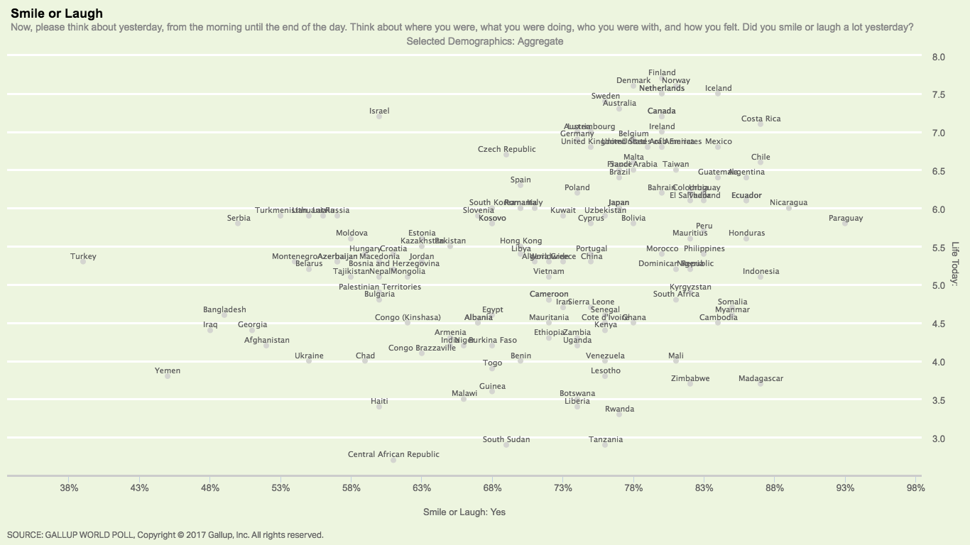
Self-reports about happiness and life satisfaction are known to correlate with things that people typically associate with contentment, such as cheerfulness and smiling. (Inthis scatter plotyou can see that countries where people have higher self-reported life satisfaction are also countries where people tend to smile more).
Experimental psychologists have also shown that self reports of well-being from surveys turn out to correlate with activity in the parts of the brain associated with pleasure and satisfaction. And various surveys have confirmed that people who say they are happy also tend to sleep better and express positive emotions verbally more frequently.
The following table, adapted from Kahneman and Krueger (2006)26, provides a list of the variables that researchers have found to be related to self-reported happiness and life satisfaction.
The main conclusion from the evidence is that survey-based measures of happiness and life satisfaction do provide a reasonably consistent and reliable picture of subjective well-being.
|
Correlates of high life satisfaction and happiness |
|---|
|
Smiling frequency |
|
Smiling with the eyes (“unfakeable smile”) |
|
Ratings of one’s happiness made by friends |
|
Frequent verbal expressions of positive emotions |
|
Sociability and extraversion |
|
Sleep quality |
|
Happiness of close relatives |
|
Self-reported health |
|
High income, and high income rank in a reference group |
|
Active involvement in religion |
|
Recent positive changes of circumstances (increased income, marriage) |
Is ‘life satisfaction’ the same as ‘happiness’?
In this entry we discuss data and empirical research on happiness and life satisfaction. However, it is important to bear in mind that “life satisfaction” and “happiness” are not really synonyms. And this is of course reflected in the data, since self-reported measures of these two variables come from asking different kinds of questions.
The World Value Survey asks directly about happiness:“Taking all things together, would you say you are ( i) Very happy, (ii) Rather happy, (iii) Not very happy, (iv) Not at all happy, (v) Don’t know. ”
The Gallup World Poll, on the other hand, uses the Cantril Ladder question and asks respondents to evaluate their life:“Please imagine a ladder, with steps numbered from 0 at the bottom to 10 at the top. The top of the ladder represents the best possible life for you and the bottom of the ladder represents the worst possible life for you. On which step of the ladder would you say you personally feel you stand at this time? ”
As the following scatter plot shows, these two measures are clearly closely related (countries that score high in one measure also tend to score high in the other), yet they are not identical (there is substantial dispersion, with many countries sharing the same score in one variable but diverging in the other).
The differences in responses to questions inquiring about life satisfaction and happiness are consistent with the idea that subjective well-being has two sides: an experiential or emotional side, and an evaluative or cognitive side. Of course, the limits between emotional and cognitive aspects of well-being are blurred in our minds; so in practice both kinds of questions measure both aspects to some degree. Indeed, social scientists often construct ‘subjective well-being indexes’ where they simply average out results from various types of questions.
Are happiness averages really meaningful?
The most common way to analyze data on happiness consists in taking averages across groups of people. Indeed, cross-country comparisons of self-reported life satisfaction, such as those presented in ‘happiness rankings’, rely on national averages of reports on a scale from 0 to 10 (the Cantril Ladder).
Is it reasonable to take averages of life satisfaction scores? Or, in more technical terms: are self reports of Cantril scores really a cardinal measure of well-being?
The evidence tells us that survey-based reports on the Cantril Ladder do allow cardinal measurement reasonably well — respondents have been found to translate verbal labels, such as ‘very good’ and ‘very bad’, into roughly the same numerical values.2728
But as with any other aggregate indicator of social progress, averages need to be interpreted carefully, even if they make sense arithmetically. For example, if we look at happiness by age in a given country, we may see that older people do not appear to be happier than younger people. Yet this may be because the average-by-age figure from the snapshot confounds two factors: the age effect (people from the same cohort do get happier as they grow older, across all cohorts) and the cohort effect (across all ages, earlier generations are less happy than more recent generations). If the cohort effect is very strong, the snapshot can even give a picture that suggests people becomelesshappy as they grow older, even though the exact opposite is actually true within all generations.
This example is in fact taken from the real world: using data from the US, Sutin et al. (2013)29showed that self-reported feelings of well-being tend to increase with age across generations, but overall levels of well-being depend on when people were born.
Linguistic differences are often seen as a major obstacle for making cross-country comparisons of happiness. However, there is evidence suggesting that comparability issues, at least in respect to language, are less problematic than many people think.
Studies have shown, for example, that in interviews in which respondents are shown pictures or videos of other individuals, respondents can broadly identify whether the individual shown to them was happy or sad; and this is also true when respondents were asked to predict the evaluations of individuals from other cultural communities. (For evidence of this see Sandvik et al., 1993; Diener and Lucas, 1999).30
Studies have also shown that ‘ indigenous emotions’ across cultures (ie feelings that are unique in that they do not have equivalents in the English language) are not experienced any more frequently or differently than common translated emotions. (See Scollon et al. 2005).31
The conclusion, therefore, seems to be that there is some basic understanding among humans about what it means to be ‘happy’. Survey-based measures of self-reported life satisfaction are informative about cross-country differences, even if these comparisons are obviously noisy.
Data Sources
World Happiness Report
- Data:Country averages of self-reported life satisfaction (Question: Cantril Ladder).
- Underlying source:Gallup World Poll
- Time span:Thedata appendix in Chapter 2of the World Happiness Report 2017 includes series from 2005 to 2016 (shorter for some countries
- Available at:World Happiness Report 2017
European Commission – Eurobarometer Interactive
- Data:Life satisfaction (Question:“On the whole are you very satisfied, fairly satisfied, not very satisfied or not at all satisfied with the life you lead? ”)
- Geographical coverage:EU countries
- Time span:1973 – 2015
- Available at:http : //ec.europa.eu/commfrontoffice/publicopinion/index.cfm/Chart/index
The World Value Survey (WVS)
- Data:Happiness and life satisfaction, as well as many other social and cultural characteristics from cross-national time-series surveys. The micro data (i.e. a dataset with one observation per respondent) is also open to the public.
- Geographical coverage:The WVS covers almost 100 societies (nearly 90% of the world’s population). But not all countries have observations in each survey wave.
- Time span:Several waves of surveys from 1981 to 2014
- Available at:http://www.worldvaluessurvey.org/WVSDocumentationWVL.jsp
Pew Global Attitudes Survey
- Data:Life satisfaction (Question: Cantril Ladder). Country tables report answers by score (i.e. country-level histograms)
- Geographical coverage:38, 000 respondents in forty-four countries
- Time span:Several waves of surveys from 2002
- Available at:www.pewglobal.org
US General Social Survey
- Data:Time-series data on happiness and many other social and cultural characteristics (Question:“Taken all together, how would you say things are these days – would you say that you are very happy, pretty happy, or not too happy?”)
- Geographical coverage:US
- Time span:Yearly surveys since 1972
- Available at:https://gssdataexplorer.norc.org
British Office for National Statistics
- Data:Personal well-being estimates (life satisfaction , whether you feel the things you do in life are worthwhile, happiness and anxiety); broken down by age, disability, relationship status, ethnicity, religion, sex and sexual identity, using the Annual Population Survey three year combined dataset.
- Geographical coverage:UK and constituent countries
- Time span:Pooled data (2017 release pools 2013 – 2015) / li>
- Available at:https://gssdataexplorer.norc.org
Germany – Deutsche Post Glücksatlas
- Data:Subnational averages of self-reported life satisfaction
- Geographical coverage:Germany
- Time span:Pooled data (2012 – 2016 or latest release)
- Available at:http://www.gluecksatlas.de/
The World Database of Happiness, hosted at the ‘ Erasmus University Rotterdam ‘here, provides a wealth of data and study results on happiness. It is described by the authors as “an archive of research findings on subjective enjoyment of life”.
In this archive you can find measures of happiness inequality, as well as time series for a vast range of countries. You also find correlational studies with just about any measure you can imagine. It also provides a list of tools (‘apps’) with which one can records one’s own happiness and compare with the happiness of other people and / or track one’s own happiness over time.


GIPHY App Key not set. Please check settings