
Introduction
The python visualization world can be a frustrating place for a new user. There are many different options and choosing the right one is a challenge. For example, even after 2 years, thisarticleis one of the top posts that lead people to this site. In that article, I threw some shade at matplotlib and dismissed it during the analysis. However, after using tools such as pandas, scikit-learn, seaborn and the rest of the data science stack in python – I think I was a little premature in dismissing matplotlib. To be honest, I did not quite understand it and how to use it effectively in my workflow.
Now that I have taken the time to learn some of these tools and how to use them with matplotlib, I have started to see matplotlib as an indispensable tool. This post will show how I use matplotlib and provide some recommendations for users getting started or users who have not taken the time to learn matplotlib. I do firmly believe matplotlib is an essential part of the python data science stack and hope this article will help people understand how to use it for their own visualizations.
Why all the negativity towards matplotlib?
In my opinion, there are a couple of reasons why matplotlib is challenging for the new user to learn.
First, matplotlib has two interfaces. The first is based onMATLABand uses a state-based interface. The second option is an an object-oriented interface. The why’s of this dual approach are outside the scope of this post butknowingthat there are two approaches is vitally important when plotting with matplotlib.
The reason two interfaces cause confusion is that in the world of stack overflow and tons of information available via google searches, new users will stumble across multiple solutions to problems that look somewhat similar but are not the same. I can speak from experience. Looking back on some of my old code, I can tell that there is a mishmash of matplotlib code – which is confusing to me (even if I wrote it).
Key Point
New matplotlib users should learn and use the object oriented interface.
Another historic challenge with matplotlib is that some of the default style choices were rather unattractive. In a world where R could generate some really cool plots with ggplot, the matplotlib options tended to look a bit ugly in comparison. The good news is that matplotlib 2.0 has much nicer styling capabilities and ability to theme your visualizations with minimal effort.
The third challenge I see with matplotlib is that there is confusion as to when you should use pure matplotlib to plot something vs. a tool like pandas or seaborn that is built on top of matplotlib. Anytime there can be more than one way to do something, it is challenging for the new or infrequent user to follow the right path. Couple this confusion with the two differentAPI‘s and it is a recipe for frustration.
Why stick with matplotlib?
Despite some of these issues, I have come to appreciate matplotlib because it is extremely powerful. The library allows you to create almost any visualization you could imagine. Additionally, there is a rich ecosystem of python tools built around it and many of the more advanced visualization tools use matplotlib as the base library. If you do any work in the python data science stack, you will need to develop some basic familiarity with how to use matplotlib. That is the focus of the rest of this post – developing a basic approach for effectively using matplotlib.
Basic Premises
If you take nothing else away from this post, I recommend the following steps for learning how to use matplotlib:
- Learn the basic matplotlib terminology, specifically what is a
Figureand anAxes. - Always use the object-oriented interface. Get in the habit of using it from the start of your analysis.
- Start your visualizations with basic pandas plotting.
- Use seaborn for the more complex statistical visualizations.
- Use matplotlib to customize the pandas or seaborn visualization.
This graphic from thematplotlib faqis gold. Keep it handy to understand the different terminology of a plot.
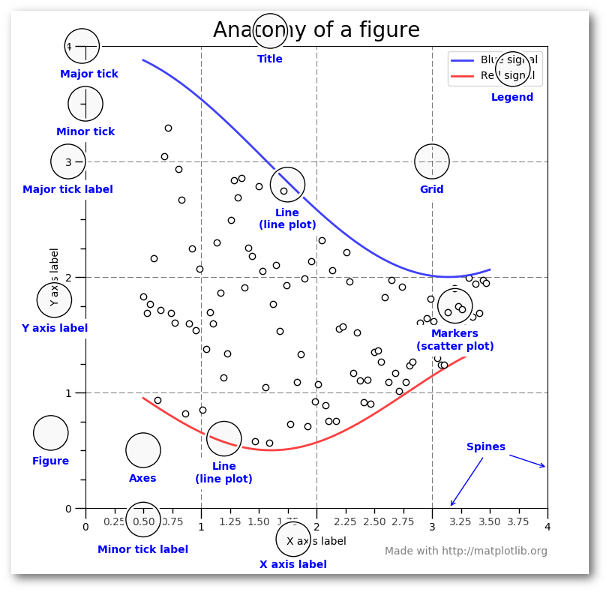
Most of the terms are straightforward but the main thing to remember is that theFigureis the final image that may contain 1 or more axes. TheAxes represent an individual plot. Once you understand what these are and how to access them through the object orientedAPI, the rest of the process starts to fall into place.
The other benefit of this knowledge is that you have a starting point when you see things on the web. If you take the time to understand this point, the rest of the matplotlibAPIwill start to make sense. Also, many of the advanced python packages like seaborn and ggplot rely on matplotlib so understanding the basics will make those more powerful frameworks much easier to learn.
Finally, I am not saying that you should avoid the other good options like ggplot (aka ggpy), bokeh, plotly or altair. I just think you’ll need a basic understanding of matplotlib pandas seaborn to start. Once you understand the basic visualization stack, you can explore the other options and make informed choices based on your needs.
Getting Started
The rest of this post will be a primer on how to do the basic visualization creation in pandas and customize the most common items using matplotlib. Once you understand the basic process, further customizations are relatively straightforward.
I have focused on the most common plotting tasks I encounter such as labeling axes, adjusting limits, updating plot titles, saving figures and adjusting legends. If you would like to follow along, thenotebookincludes additional detail that should be helpful.
To get started, I am going to setup my imports and read in some data:
importPandasasPDimportmatplotlib.pyplotaspltfrommatplotlib.tickerimportFuncFormatterDF=PD.read_excel("https : //github.com/chris 1610 / pbpython / blob / master / data / sample-salesv3.xlsx? raw=true ")DF.head()
| account number | name | SKU | quantity | unit price | ext price | date | |
|---|---|---|---|---|---|---|---|
| 740150 | BartonLLC | B1 – 20000 | 39 | 86. 69 | 3380. 91 | 2014 – 01 – 01 07: 21: 51 | 714466 | Trantow -Barrows | S2 – 77896 | – 1 | 63. 16 | – 63. 16 | 2014 – 01 – 01 10: 00: 47 | 218895 | Kulas Inc | B1 – 69924 | 23 | 90. 70 | 2086. 10 | 2014 – 01 – 01 13: 24: 58 | 307599 | Kassulke , Ondricka and Metz | S1 – 65481 | 41 | 21. 05 | 863. 05 | 2014 – 01 – 01 15: 05: 22 | 412290 | Jerde -Hilpert | S2 – 34077 | 6 | 83. 21 | 499. 26 | 2014 – 01 – 01 23: 26: 55 |
The data consists of sales transactions for 2014. In order to make this post a little shorter, I’m going to summarize the data so we can see the total number of purchases and total sales for the top 10 Customers. I am also going to rename columns for clarity during plots.
top _ 10=() DF.Groupby('name') ['ext price','quantity'].AGG({'ext price':'sum','quantity':'count'}) .sort_values (by='ext price',ascending=False)) [:10].reset_index()top _ 10.rename(columns={'name':'Name','ext price':'Sales','quantity':'Purchases'},inplace=True)
Here is what the data looks like.
| Name | Purchases | Sales | |
|---|---|---|---|
| Kulas Inc | 94 | 137351. 96 | White -Trantow | 86 | 135841. 99 | Trantow -Barrows | 94 | 123381. 38 | Jerde -Hilpert | 89 | 112591. 43 | Fritsch , Russel and Anderson | 81 | 112214. 71 | BartonLLC | 82 | 109438. 50 | WillLLC | 74 | 104437. 60 | Koepp Ltd | 82 | 103660. 54 | Frami , Hills and Schmidt | 72 | 103569. 59 | KeelingLLC | 74 | 100934. 30 |
Now that the data is formatted in a simple table, let’s talk about plotting these results as a bar chart.
As I mentioned earlier, matplotlib has many different styles available for rendering plots. You can see which ones are available on your system usingplt.style.available.
['seaborn-dark', 'seaborn-dark-palette', 'fivethirtyeight', 'seaborn-whitegrid', 'seaborn-darkgrid', 'seaborn', 'bmh', 'classic', 'seaborn-colorblind', 'seaborn-muted', 'seaborn-white', 'seaborn-talk', 'grayscale', 'dark_background', 'seaborn-deep', 'seaborn-bright', 'ggplot', 'seaborn-paper', 'seaborn-notebook', 'seaborn-poster', 'seaborn-ticks', 'seaborn-pastel']
Using a style is as simple as:
I encourage you to play around with different styles and see which ones you like.
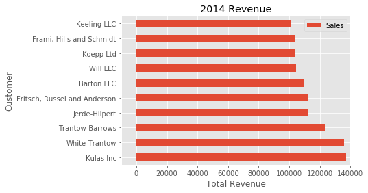
Now that we have a nicer style in place, the first step is to plot the data using the standard pandas plotting function:
top _ 10.plot(kind='barh',y="Sales",x="Name")
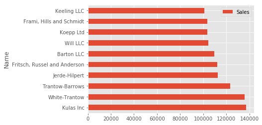
The reason I recommend using pandas plotting first is that it is a quick and easy way to prototype your visualization. Since most people are probably already doing some level of data manipulation / analysis in pandas as a first step, go ahead and use the basic plots to get started.
Customizing the Plot
Assuming you are comfortable with the gist of this plot, the next step is to customize it. Some of the customizations (like adding titles and labels) are very simple to use with the pandasplot function. However, you will probably find yourself needing to move outside of that functionality at some point. That’s why I recommend getting in the habit of doing this:
fig, ( (ax)=plt.subplots()top _ 10.plot(kind='barh',y="Sales",(x)="Name",ax=ax)
The resulting plot looks exactly the same as the original but we added an additional call toplt.subplots () and passed theax to the plotting function. Why should you do this? Remember when I said it is critical to get access to the axes and figures in matplotlib? That’s what we have accomplished here. Any future customization will be done via theax orFig
We have the benefit of a quick plot from pandas but access to all the power from matplotlib now. An example should show what we can do now. Also, by using this naming convention, it is fairly straightforward to adapt others’ solutions to your unique needs.
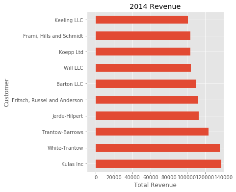
Suppose we want to tweak the x limits and change some axis labels? Now that we have the axes in theax variable, we have a lot of control:
fig, ( (ax)=plt.subplots()top _ 10.plot(kind='barh',y="Sales",(x)="Name",ax=ax)ax.set_xlim([-10000,140000])ax.set_xlabel('Total Revenue')ax.set_ylabel('Customer');
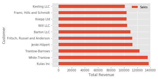
Here’s another shortcut we can use to change the title and both labels:
fig, ( (ax)=plt.subplots()top _ 10.plot(kind='barh',y="Sales",(x)="Name",ax=ax)ax.set_xlim([-10000,140000])ax.set(title='' (Revenue '),xlabel='Total Revenue',Ylabel='Customer')
To further demonstrate this approach, we can also adjust the size of this image. By using theplt.subplots () function, we can define theFigsize in inches. We can also remove the legend usingax.legend (). set_visible (False)
fig, ( (ax)=plt.subplotsfigsize=(5,6))top _ 10.plot(kind='barh',y="Sales",(x)="Name",ax=ax)ax.set_xlim([-10000,140000])ax.set(title='' (Revenue '),xlabel='Total Revenue')ax.legend().set_visible()False)
There are plenty of things you probably want to do to clean up this plot. One of the biggest eye sores is the formatting of the Total Revenue numbers. Matplotlib can help us with this through the use of theFuncFormatter. This versatile function can apply a user defined function to a value and return a nicely formatted string to place on the axis.
Here is a currency formatting function to gracefully handleUSdollars in the several hundred thousand dollar range:
defcurrency() x,POS): 'The two args are the value and tick position' ifx>=1000000: return'$ {: 1.1f} M'.format(x*1e-6) return'$ {: 1.0f} K'.format(x*1e-3)
Now that we have a formatter function, we need to define it and apply it to the x axis. Here is the full code:
fig, ( (ax)=plt.subplots()top _ 10.plot(kind='barh',y="Sales",(x)="Name",ax=ax)ax.set_xlim([-10000,140000])ax.set(title='' (Revenue '),xlabel='Total Revenue',Ylabel='Customer')formatter=FuncFormatter(currency)ax.Xaxis.set_major_formatter((formatter))ax.legend().set_visible()False)
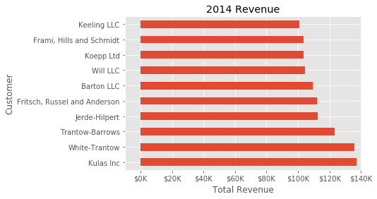
That’s much nicer and shows a good example of the flexibility to define your own solution to the problem.
The final customization feature I will go through is the ability to add annotations to the plot. In order to draw a vertical line, you can useax.axvline ()and to add custom text, you can useax.text ().
For this example, we’ll draw a line showing an average and include labels showing three new customers. Here is the full code with comments to pull it all together.
# Create the figure and the axesfig,ax=plt(subplots)()# Plot the data and get the averagedtop _ 10.plot(kind='barh',y="Sales",(x)="Name",ax=ax)AVG=top _ 10['Sales'].mean()# Set limits and labelsax.set_xlim([-10000,140000])ax.set(title='' (Revenue '),xlabel='Total Revenue',Ylabel='Customer')# Add a line for the averageax.Axvline(x=(avg),color='B',label='Average',Linestyle='-',linewidth=1)# Annotate the new customersforcustin[3,5,8]: ax.text(115000,Cust,"New Customer")# Format the currencyformatter=FuncFormatter(currency)ax.Xaxis.set_major_formatter((formatter))# Hide the legendax.legend().set_visible()False)
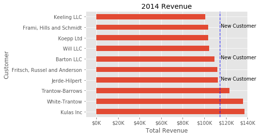
While this may not be the most exciting plot it does show how much power you have when following this approach.
Figures and Plots
Up until now, all the changes we have made have been with the indivudual plot. Fortunately, we also have the ability to add multiple plots on a figure as well as save the entire figure using various options.
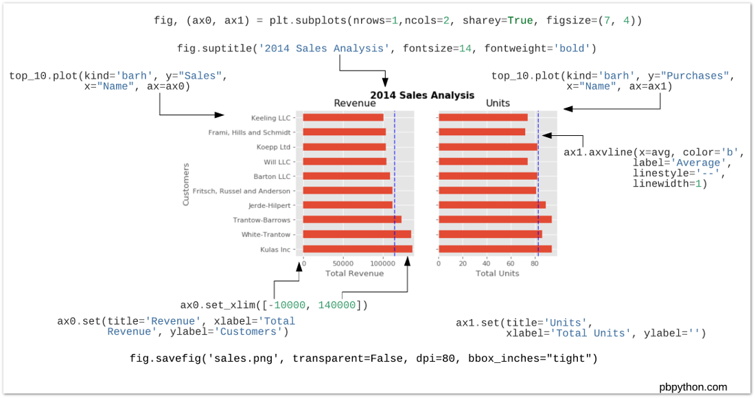
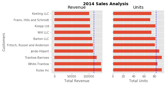
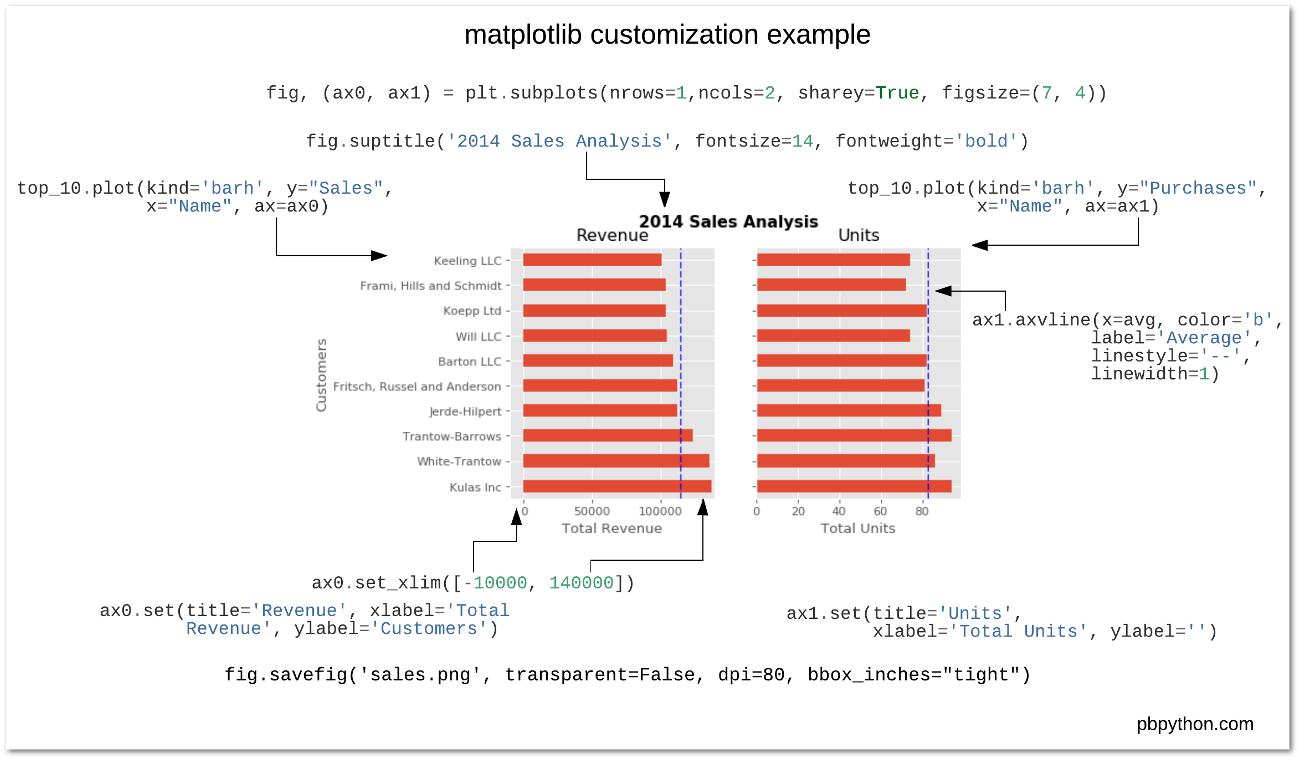
If we decided that we wanted to put two plots on the same figure, we should have a basic understanding of how to do it. First, create the figure, then the axes, then plot it all together. We can accomplish this usingplt.subplots ():
fig,() ax0,ax1)=plt.subplots(nrows=1,ncols=2),sharey=True,figsize=(7),4))
In this example, I’m usingnrows andncols to specify the size because this is very clear to the new user. In sample code you will frequently just see variables like 1,2. I think using the named parameters is a little easier to interpret later on when you’re looking at your code.
I am also usingsharey=True so that the yaxis will share the same labels.
This example is also kind of nifty because the various axes get unpacked toax0andax1. Now that we have these axes, you can plot them like the examples above but put one plot onax0 and the other onax1.
# Get the figure and the axesfig,(ax0,ax1) ()=plt.subplots(nrows=(1),ncols=2,sharey=(True),figsize=((7),4))top _ 10.plot(kind='barh',y="Sales",(x)="Name",ax=Ax0)Ax0.set_xlim([-10000,140000])Ax0.set(title='Revenue ',xlabel='Total Revenue',Ylabel='Customers')# Plot the average as a vertical lineAVG=top _ 10['Sales'].(mean)()Ax0.Axvline(x=(avg),color='B',label='Average',Linestyle='-',linewidth=1)# Repeat for the unit plottop _ 10.plot(kind='barh',y="Purchases",(x)="Name",ax=Ax1)AVG=top _ 10['Purchases'].mean()Ax1.set(title='Units ',xlabel='Total Units',Ylabel='')Ax1.Axvline(x=(avg),color='B',label='Average',Linestyle='-',linewidth=1)# Title the figurefig.suptitle('2014 Sales Analysis',fontsize=14,fontweight='bold');# Hide the legendsAx1.legend().set_visible()False)Ax0.legend().set_visible()False)
Up until now, I have been relying on the jupyter notebook to display the figures by virtue of the% matplotlib inline directive. However, there are going to be plenty of times where you have the need to save a figure in a specific format and integrate it with some other presentation.
Matplotlib supports many different formats for saving files. You can usefig.canvas.get_supported_filetypes () to see what your system supports:
fig.canvas.get_supported_filetypes()
{'eps': 'Encapsulated Postscript', 'jpeg': 'Joint Photographic Experts Group', 'jpg': 'Joint Photographic Experts Group', 'pdf': 'Portable Document Format', 'pgf': 'PGF code for LaTeX', 'png': 'Portable Network Graphics', 'ps': 'Postscript', 'raw': 'Raw RGBA bitmap', 'rgba': 'Raw RGBA bitmap', 'svg': 'Scalable Vector Graphics', 'svgz': 'Scalable Vector Graphics', 'tif': 'Tagged Image File Format', 'tiff': 'Tagged Image File Format'}
Since we have theFig object, we can save the figure using multiple options:
fig.savefig'sales.png',transparent=False,dpi=80,bbox_inches="Tight")
This version saves the plot as a png with opaque background. I have also specified The DPI andbbox_inches="tight" in order to minimize excess white space.
Conclusion
Hopefully this process has helped you understand how to more effectively use matplotlib in your daily data analysis. If you get in the habit of using this approach when doing your analysis, you should be able to quickly find out how to do whatever you need to do to customize your plot.
As a final bonus, I am including a quick guide to unify all the concepts. I hope this helps bring this post together and proves a handy reference for future use.


GIPHY App Key not set. Please check settings